Creating the simple pulse sequence diagram as code#
This will also for accuracy and flexibility when used for visualization
import numpy as np
from matplotlib import pyplot as plt
def plt_sinc(x_start, x_dur):
    """Plot a sinc function that start at time x_start and lasts for x_dur ms."""
    n_vals = 100
    sinc_vals = np.sinc(np.linspace(-4, 4, n_vals))
    sinc_timing = np.linspace(x_start, x_start+x_dur, n_vals)
    plt.plot(sinc_timing, sinc_vals, 'k', linewidth=0.75)

def plt_sin(x_center, x_dur, n_cycles, color):
    """
    Plot a sin wave

    Parameters
    ----------
    x_center: The center time for the sin wave in ms
    x_dur: The duration of the sin wave
    n_cycles: The number of cycles in the sin wave
    color: The color of the line for the sin wave
    """
    n_vals = 1000
    sin_vals = np.sin(n_cycles*2*np.pi*np.linspace(0,1,n_vals))/2
    sin_timing = np.linspace(x_center-x_dur/2, x_center+x_dur/2, n_vals)
    plt.plot(sin_timing, sin_vals, color, linewidth=0.75)


def create_simple_pulse_seq(tes, read_time=None, x_axis_duration=None, n_acq = 2, n_cycles=16, sinc_dur=2, title=None):
    """
    Create a simple pulse sequence figure with the goal of explaining multi-echo

    Parameters
    ----------
    tes (List): The echo times (TEs) in milliseconds
    read_time: The duration of the read time for each echo (i.e. how long the sinusoids will appear)
        Default is None. For >2 echos, this will calculate read times as
        0.95*(the difference between the first wo echoes)
        Will crash if this is None with only 1 echo
    x_axis_duration: The range of the x axis goes from x to this value.
        Default is None and will be long enough to show the full echo train
        Can be set so that several plots have the same x range and can be compared
    n_acq: The number of sinc pulses followed by sinusoids to include
        Default is 2
    n_cycles: Number of sinusoid cycles to show in each echo train
        Default is 16, which is less than most actual acquisitions,
        but more realistic values make it hard to see the sinusoids compressing with different read_times
    sinc_dur: The shape of the sinc for the excitation pulse is hard coded,
    but it can be made larger or smaller to support visualization
        Default is 2
    title: A text string title for the plot

    Returns
    -------
    read_time, x_axis_duration: Same has above, but will be want was calculated within the code
        Useful if running the longest duration pulse sequence first and then using the same
        x_axis_duration for all other plots
    """

    if len(tes) == 1:
        colorlist = ['g']
        #if x_axis_duration == None:
        #    x_axis_duration = n_acq*(tes[0] + read_time/2) + 7
    else:
        colorlist = ['r', 'g', 'b', 'c', 'm', 'y', 'k']
        if read_time == None:
            read_time = 0.95*(tes[1]-tes[0])
        if x_axis_duration == None:
            x_axis_duration = n_acq*(tes[-1] + read_time/2) + 7

    excite_start = 0
    for acq_iter in range(n_acq):
        plt_sinc(excite_start, sinc_dur)
        for echo_idx, echo_val in enumerate(tes):
            plt_sin(excite_start+echo_val, read_time, n_cycles, colorlist[echo_idx])
            plt.plot(excite_start+np.linspace(sinc_dur/2, echo_val, 20), np.tile(0.52+echo_idx*0.1, 20), 'k', linestyle='--')
            plt.text(excite_start+(echo_val - sinc_dur/2)/2, 0.53+0.1*echo_idx, f"TE {echo_idx+1}")
        excite_start = excite_start + echo_val + read_time/2 + 0.5
        if acq_iter == 0:
            plt.plot([0, excite_start], [1, 1], 'k', linestyle='-.')
            plt.text(excite_start*0.45, 1.01, "1 acquisition cycle")

    plt.xlim(0,x_axis_duration)
    plt.xlabel('Time (ms)')
    if title:
        plt.title(title)

    return read_time, x_axis_duration
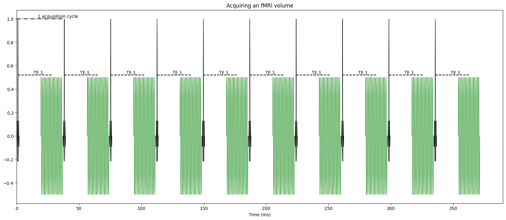
fig = plt.figure(figsize=(20,8))

create_simple_pulse_seq([28], read_time=17.347, n_acq=10, title="Acquiring an fMRI volume")
(17.347, None)
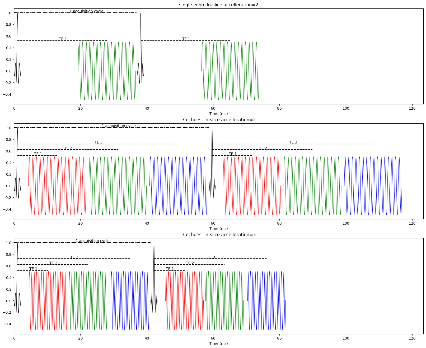
fig, axes = plt.subplots(3, 1, figsize=(20,16))

plt.subplot(3,1,2)
read_time, x_axis_duration = create_simple_pulse_seq([13, 31.26, 49.52], title="3 echoes. In-slice accelleration=2")

plt.subplot(3,1,1)
create_simple_pulse_seq([28], read_time=read_time, x_axis_duration=x_axis_duration, title="single echo. In-slice accelleration=2")

plt.subplot(3,1,3)
create_simple_pulse_seq([10.2, 22.27, 34.94], x_axis_duration=x_axis_duration, title="3 echoes. In-slice accelleration=3")
(11.4665, 123.387)