Signal Decay#
Important
This chapter should differentiate itself from TE_Dependence by focusing on the application of (2) to raw signal, rather than decompositions.
Important
The general flow of this chapter should be:
Explain the monoexponential decay equation.
Mention other models of signal decay, including biexponential models, and why they generally aren’t used on multi-echo fMRI data.
Show signal decay in real data.
Start with single-volume brain images across increasing echo times.
Next, show a scatter plot of the values for a single voxel over time, separated by echo time, to give a better sense of the scale of the decay.
Line plots of the different echo times for a single voxel to show that decay is not a simple scalar.
Show a simulated, static decay curve.
Show the difference in decay curves for “active” and “inactive” states in the same voxel (i.e., different T2* values).
Show how single-echo data fluctuate over time, given an underlying signal.
Add a changing decay curve underneath the single-echo data point.
Overlay points for the changing T2* and S0 values as well.
Plot the decay curves of the same relative fluctuations, but dependent solely on S0 or T2* changes.
Overlay single-echo data points on the fluctuating decay curves, to show how the two types of fluctuations cannot be dissociated using single-echo data.
Plot scaled T2* against the single-echo data in a line plot. The time series will be very similar, but slightly different.
Plot scaled S0 against the single-echo data. The time series will effectively be the same.
Point out that we don’t know the underlying T2* or S0 fluctuations, so this just shows how very similar signal can come from T2* or S0.
Overlay multi-echo data points on the fluctuating decay curves, to show how the differences in the patterns are much clearer.
Discuss the effect of noise on the multi-echo signal. Perhaps plot a single voxel’s real values?
Point to the TE Dependence chapter.
In this chapter, we illustrate how BOLD signal decays and how we can glean useful information from that decay rate.
To do this, we will use a combination of simulated and real multi-echo data.
Signal decays as echo time increases#
To start, let us look at how BOLD signal changes with increasing echo time in real data. The data we use is a single resting-state run, with five echo times.
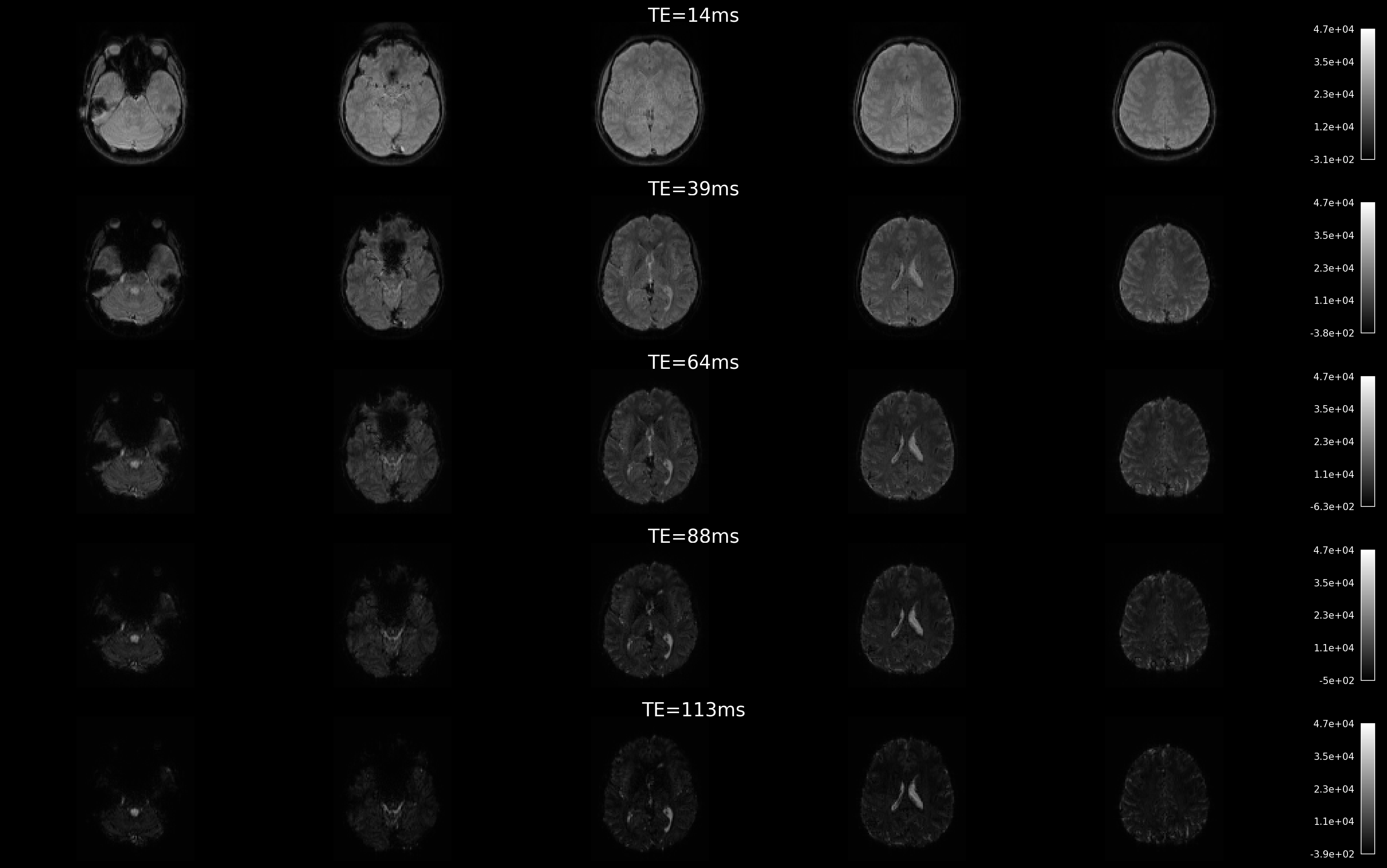
Fig. 3 Signal decay in the brain.#
The nature of multi-echo (ME) acquisition leads to signal decay, with high signal-to-noise ratio (SNR) at short echo times (TE) and lower SNR at longer TEs. You may notice that the images appear darker as the signal decays with increasing TE. Additionally, image contrast tends to increase with longer echo times.
Echo-specific data and echo time#
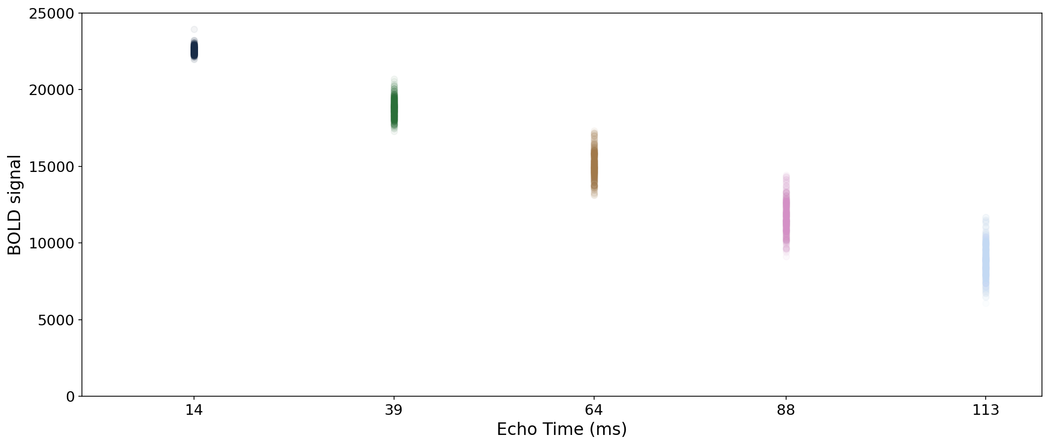
Fig. 4 Scatter plot of voxel’s values by echo time.#
Here, we visualize the temporal variation of a single voxel’s signal (y-axis) across four different echo times (TE) on the x-axis. As expected, the signal magnitude decreases with increasing TE.
The signal itself changes with echo time as well#
Let us visualize the time series of one voxel acquired at different echo times. While the overall scale of the signal decreases with echo time, the actual pattern of the signal changes as well.
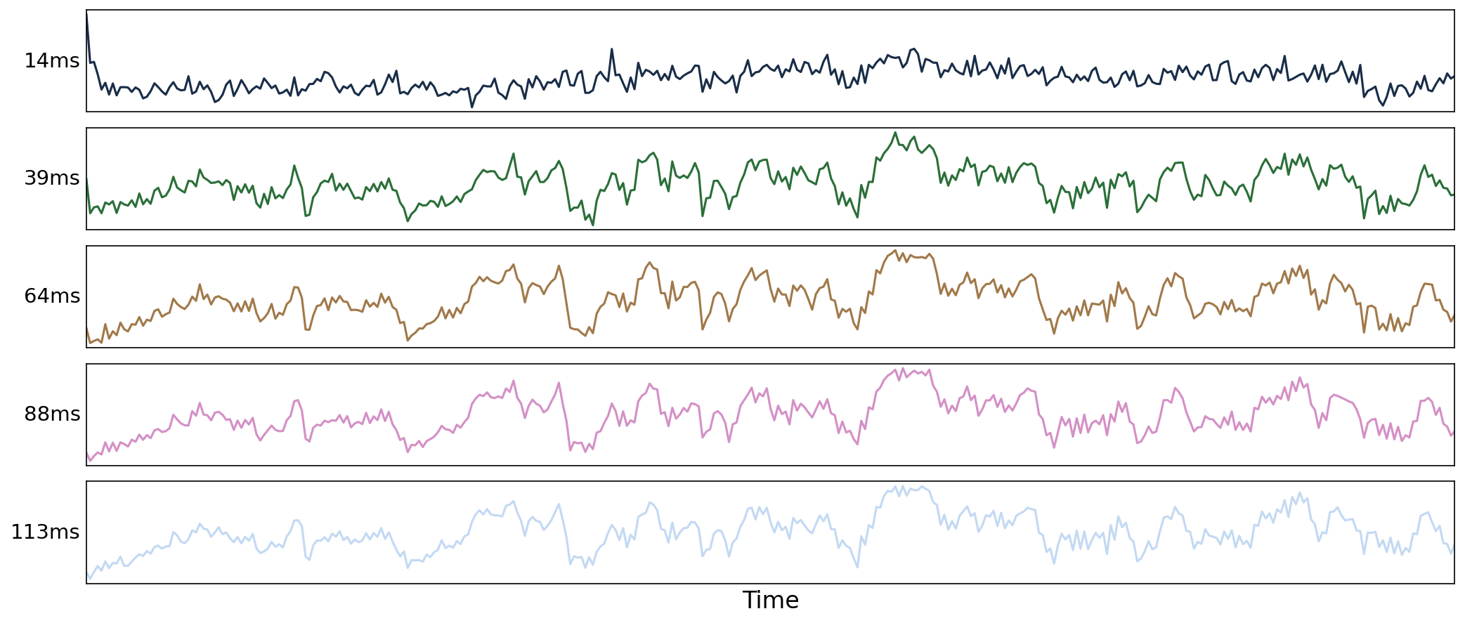
Fig. 5 Time series from a voxel for each echo.#
The impact of \(T_{2}^{*}\) and \(S_{0}\) fluctuations on BOLD signal#
In this section, we investigate the two factors driving changes in the signal decay pattern: \(T_{2}^{*}\) and \(S_{0}\).
Firstly, let us run some code to simulate the signal decay curve.
# Simulate data
SINGLEECHO_TE = np.array([30])
# For a nice, smooth curve
FULLCURVE_TES = np.round(np.arange(0, 121, 1), decimals=5)
n_echoes = len(FULLCURVE_TES)
pal = sns.color_palette("cubehelix", 8)
Simulate \(T_{2}^{*}\) and \(S_{0}\) fluctuations#
# Simulate data
# We'll convolve with HRF just for smoothness
hrf = first_level.spm_hrf(1, oversampling=1)
N_VOLS = 21
SCALING_FRACTION = 0.1 # used to scale standard deviation
MEAN_T2S = 35
MEAN_S0 = 16000
# simulate the T2*/S0 time series
# The original time series will be a random time series from a normal distribution,
# convolved with the HRF
rng = np.random.default_rng(42)
ts = rng.normal(loc=0, scale=1, size=(N_VOLS + 20,))
ts = signal.convolve(ts, hrf)[20 : N_VOLS + 20]
ts *= SCALING_FRACTION / np.std(ts)
ts -= np.round(ts[0], decimals=5)
t2s_ts = (ts * MEAN_T2S) + MEAN_T2S
s0_ts = (ts * MEAN_S0) + MEAN_S0
Plot BOLD signal decay for a standard single-echo scan#
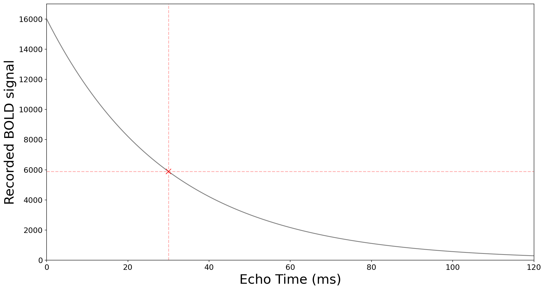
Fig. 6 BOLD signal decay for a standard single-echo scan#
At a given time point in an fMRI scan, the signal magnitude of a voxel varies depending on the echo time at which the signal is acquired. Here, we observe how the signal decays as TE increases (black curve). For example, if a single-echo scan is acquired at TE = 30 ms, the signal magnitude is approximately 5886 (red cross and dashed lines).
Plot BOLD signal decay and BOLD contrast#
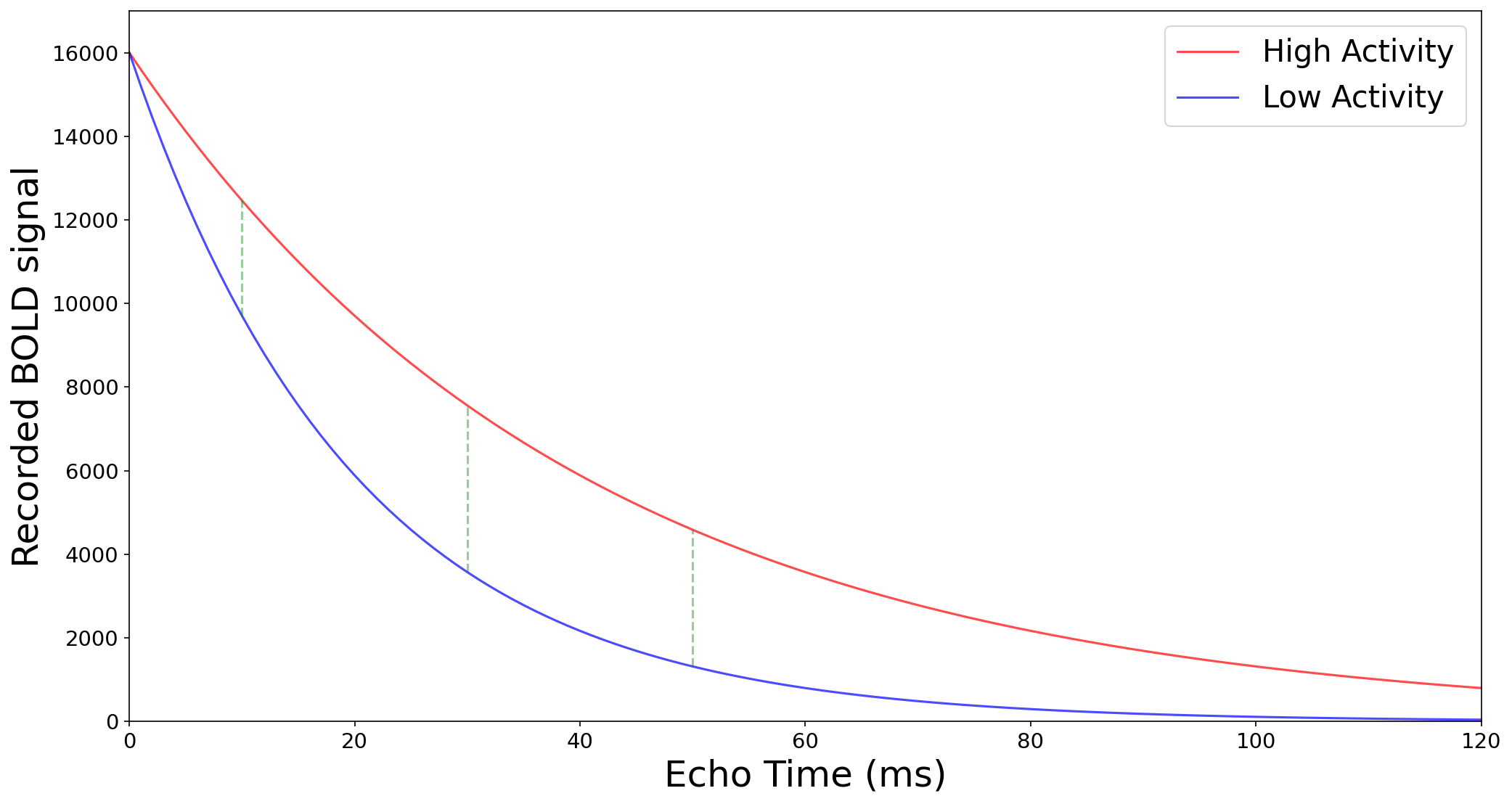
Fig. 7 BOLD signal decay and BOLD contrast#
This plot shows the signal decay for two different activity levels: one with high activity and one with low activity. Due to differences in activity and the associated T2 effects, the decay curve for low activity is steeper than that for high activity. The contrast — represented by the distance between the two curves (see green dashed lines in the figure) — increases with TE, reaching a peak around TE = 30 ms, and then begins to decrease at longer echo times (e.g., >50 ms). In practice, this means that for a given voxel, the contrast (i.e., the color difference) between low and high activity will be more visible at TE = 30 ms than at TE = 15 ms.
Plot single-echo data resulting from \(S_{0}\) and \(T_{2}^{*}\) fluctuations#
Let us visualize the case of a single echo fMRI acquisition with TE = 30ms. The top panel shows the time series of an example voxel , while the lower panel shows the associated signal magnitude fluctuation at the specific echo time (TE = 30 ms). This shows how fMRI data fluctuates over time.
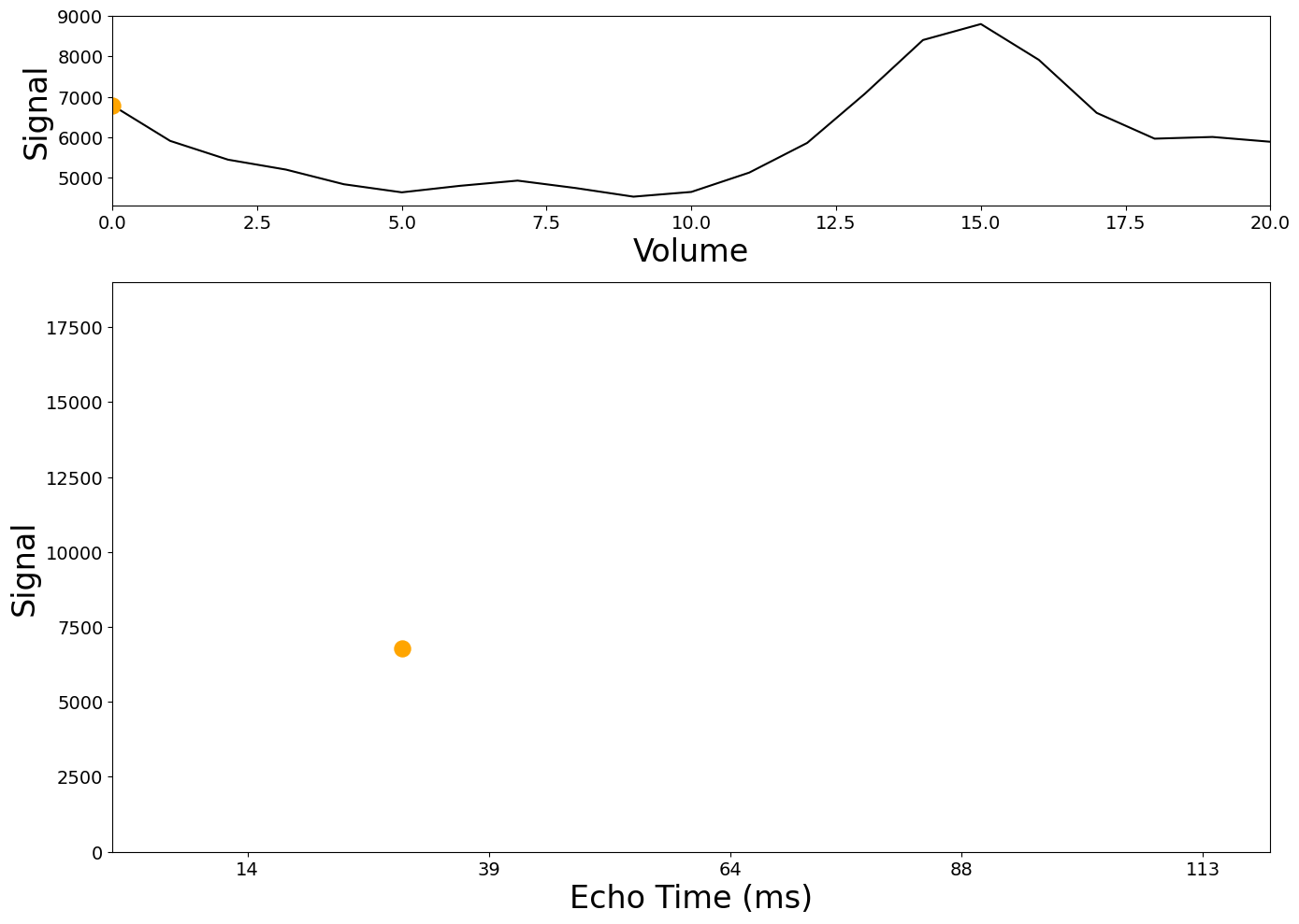
Fig. 8 Single-echo data resulting from \(S_{0}\) and \(T_{2}^{*}\) fluctuations#
Plot single-echo data and the curve resulting from \(S_{0}\) and \(T_{2}^{*}\) fluctuations#
Building on the previous figure, we visualize here how the signal of a voxel at each time point of a single-echo fMRI scan (TE=30ms) is part of a decay curve. In other words, this shows how single-echo data is a sample from a signal decay curve.
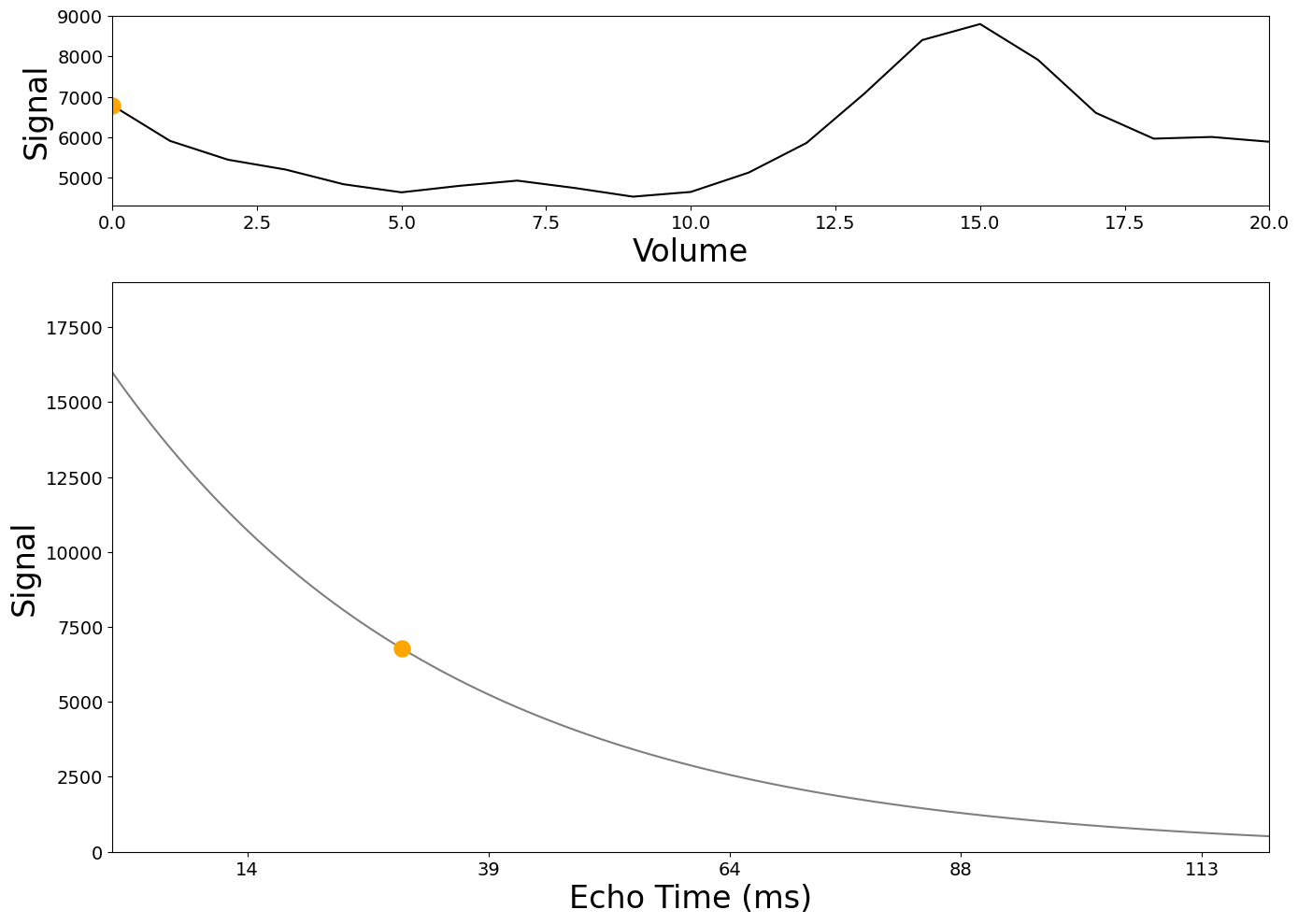
Fig. 9 Single-echo data and the curve resulting from \(S_{0}\) and \(T_{2}^{*}\) fluctuations#
Plot single-echo data, the curve, and the \(S_{0}\) and \(T_{2}^{*}\) values resulting from \(S_{0}\) and \(T_{2}^{*}\) fluctuations#
We are still in the case of a single-echo fMRI acquisition with TE=30ms. For a given voxel, the signal magnitude \(S\) is linked with \(S_0\) and \(T_2^{*}\) over time \(t\) through the formula:
Both factors of the product - \(S_0\) and the exponential with \(T_2^{*}\) - capture local fluctuations happening during MRI acquisition, but from different origins. The figure represents how the signal of a voxel is associated to \(S_0\) and \(T_2^{*}\), showing how changes in fMRI data can be driven by both factors.
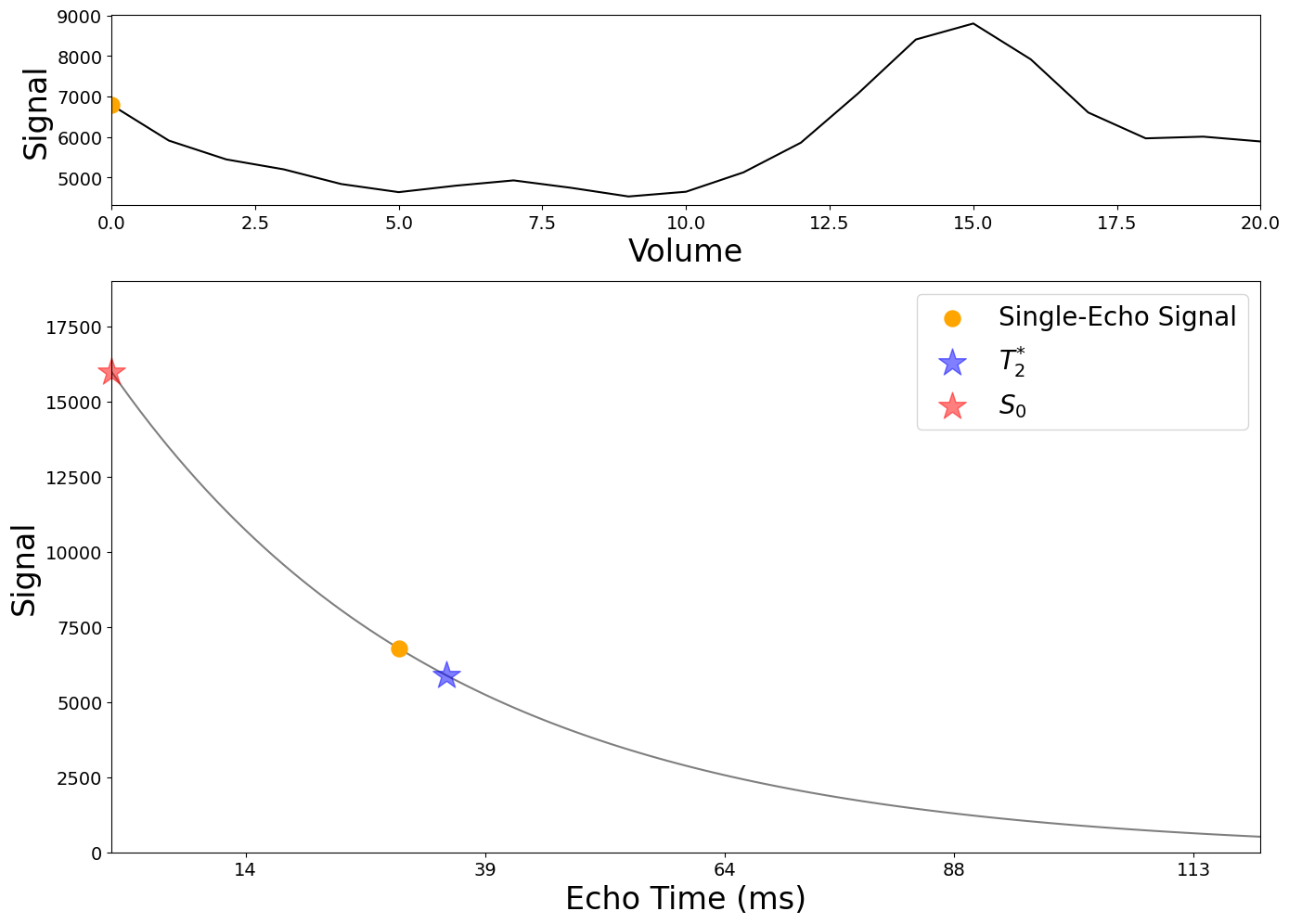
Fig. 10 Single-echo data, the curve, and the \(S_{0}\) and \(T_{2}^{*}\) values resulting from \(S_{0}\) and \(T_{2}^{*}\) fluctuations#
Plot \(S_{0}\) and \(T_{2}^{*}\) fluctuations#
Let us visualize \(S_0\) and \(T_2^{*}\) effects more closely. The bottom figure shows how the \(S_0\) and \(T_2^{*}\) curves changes compared to the original average signal decay curve. In red, the decay curve is shown when only the \(S_0\) values fluctuate (for a fixed \(T_2^{*}\) for any t). In blue the decay curve is shown when the \(T_2^{*}\) values fluctuate (for a fixed \(S_0\) for any t). The top panel represents the fluctuations of the ratio \(\frac{S_0}{T_2^{*}}\). This shows how fluctuations in \(S_0\) and \(T_2^{*}\) produce different patterns in the full signal decay curves.
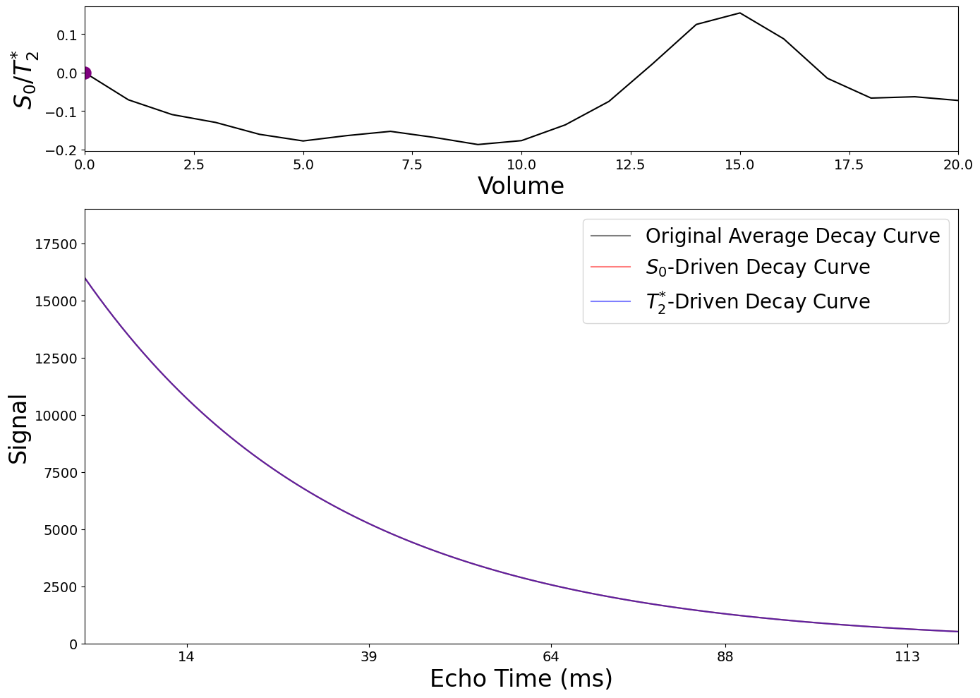
Fig. 11 \(S_{0}\) and \(T_{2}^{*}\) fluctuations#
Plot \(S_{0}\) and \(T_{2}^{*}\) fluctuations and resulting single-echo data#
Let us visualize again the case of a single echo acquisition. Because the signal is acquired for only one TE (see the red and blue dot points in the figure), it is impossible to model the \(S_0\)- and \(T_2^{*}\)- driven curves ! This shows how single-echo data, on its own, cannot distinguish between \(S_0\) and \(T_2^{*}\) fluctuations.
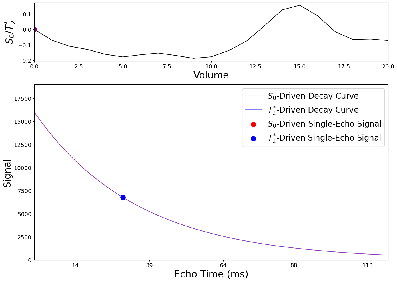
Fig. 12 \(S_{0}\) and \(T_{2}^{*}\) fluctuations and resulting single-echo data#
Plot \(S_{0}\) and \(T_{2}^{*}\) fluctuations and resulting multi-echo data#
Let us now visualize again the case of a multi-echo acquisition. Because the signal is acquired at four echo times here, we can see how S0 and T2* fluctuations produce different patterns in multi-echo data. It is now possible to model the \(S_0\)- and \(T_2^{*}\)- driven curves from the signal !
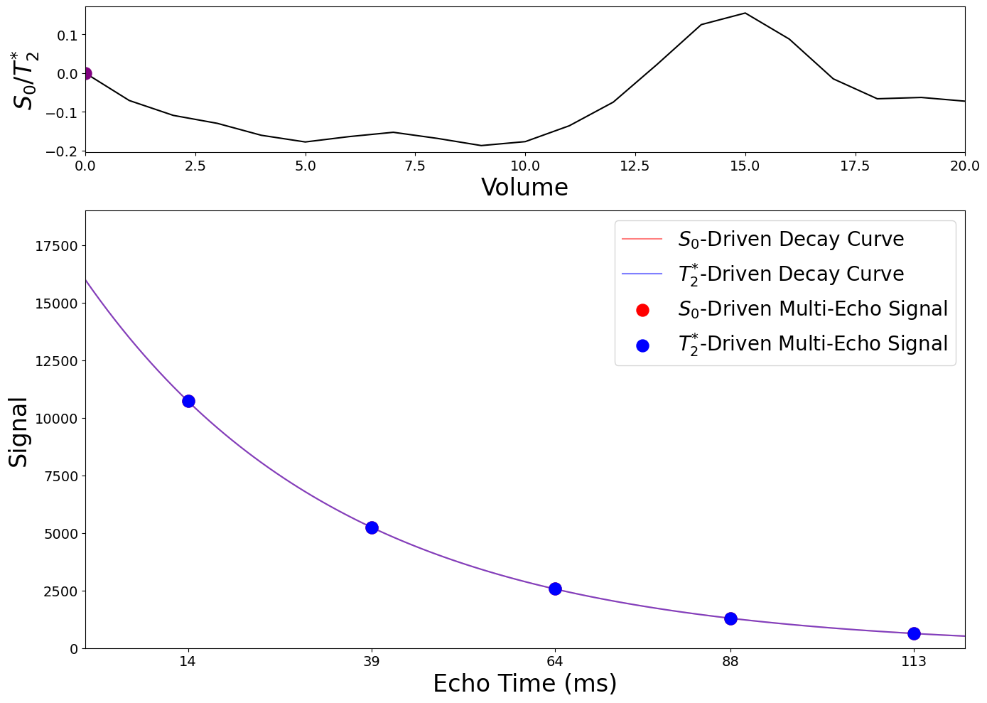
Fig. 13 \(S_{0}\) and \(T_{2}^{*}\) fluctuations and resulting multi-echo data#
Plot \(T_{2}^{*}\) against BOLD signal from single-echo data (TE=30ms)#
When the BOLD signal is driven entirely by \(T_2^{*}\) fluctuations, the BOLD signal is very similar to a scaled version of those \(T_2^{*}\) fluctuations, but there are small differences. You may understand this intuitively by looking back to the equation (1). You can see that if \(S_0\) is fixed, the relationship between \(S\) and \(T_2^{*}\) is not purely linear over time.
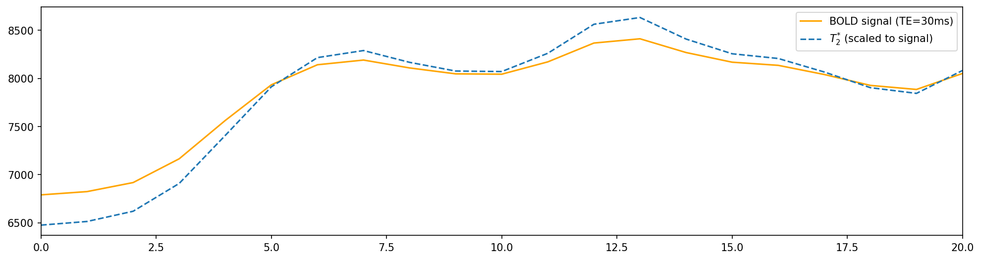
Fig. 14 \(T_{2}^{*}\) against BOLD signal from single-echo data (TE=30ms)#
Plot \(S_{0}\) against BOLD signal from single-echo data (TE=30ms)#
When the BOLD signal is driven entirely by \(S_0\) fluctuations, the BOLD signal ends up being a scaled version of the \(S_0\) fluctuations. You may understand this intuitively by looking back to the equation (1). You can see that if \(T_2^{*}\) is fixed, the relationship between \(S\) and \(S_0\) is linear over time.
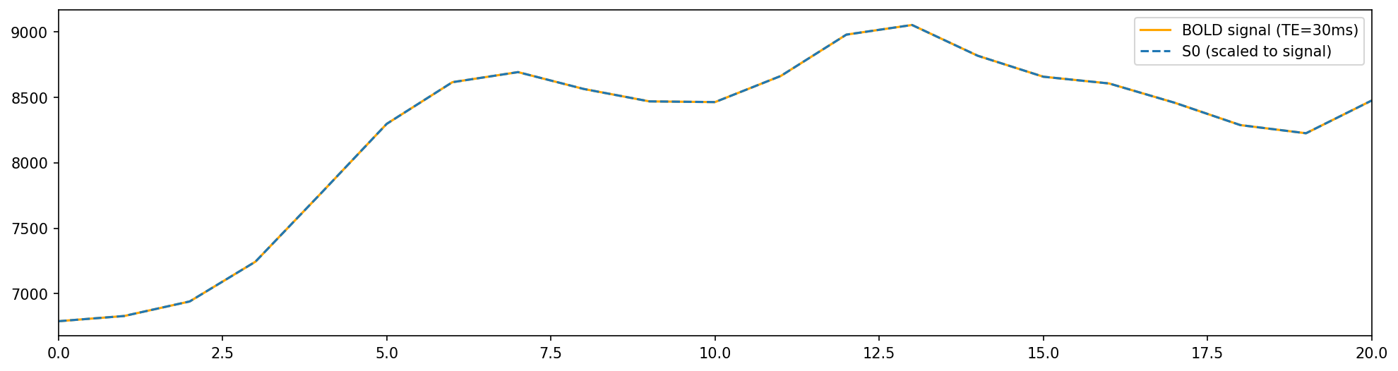
Fig. 15 \(S_{0}\) against BOLD signal from single-echo data (TE=30ms)#